New Look For Constant Warfare
Clever title aside, it’s been time for a logo change for some time now. I spent a couple weeks on this, and it was pretty frustrating. I couldn’t really decide what I wanted, had some trouble with using a designer, and my ‘name’ is sufficiently vague so as not to lend any help. Warfare is pretty generic, and trying to find something that covers all the games I play, and not just one, was just also frustrating. I finally decided on this/these after doing some Google image searches, and talking to people on Steam.

Why Cerberus?
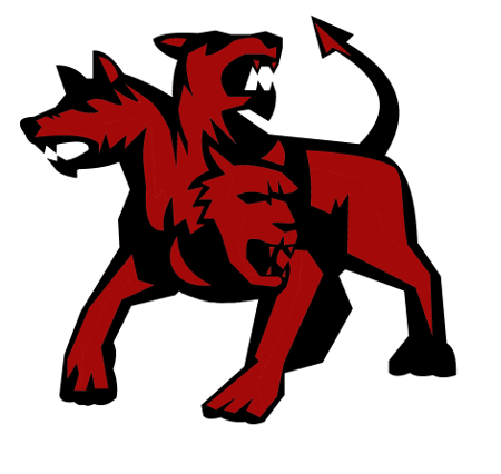
If you Google “dogs of war” a Cerberus image was one of the first things that came up. Googling further I found this image, and it was the best simple image. Cerberus guards the dead, keeping them in Hades. Sending people to Cerberus ala the ‘constant warfare’ seemed a decent fit. I also love dogs, so when nothing else came to mind, this was just fine with me. Plus, Cerberus just looks imposing. Nobody wants to mess with him. Also if you say “The Dogs of Warfare” you can almost picture the calendar…

Getting Good At Naming Puppies
I named them all of these little Cerberi according to what first popped into my head at waaaay too early/late in the morning/night. Classic is done with my traditional logo color scheme. Seems average to me. Smokey seems kind of subdued without being overly dark. Nothing pops though. Lager is red and tan, which just sounds like a beer to me. And lager is my favorite kind of beer. Probably my personal favorite. Finally, Clifford is…red. Like the dog in the kids book series by the same name. I like the simplicity, but it reminds me of other ‘famous’ logos too much I think.

I Need Your Help
While I have it narrowed down, i’m not sold on color scheme. Two tone? Three? What colors? I’d like to know what YOU think. Sometimes other perspectives can really help. The whole ‘outside looking in’ thing. These four mockups are just what I liked most out of what I have tried so far. I feel like I have pretty limited knowledge in the visual art department, so a little help would be great. Just look to the right, or scroll to the bottom of the post, and vote for which you like best in the poll. If you like one, that is. If you have any color suggestions, you can use the comments below. I like the logo. I’ve already paid for the rights for it, and can’t wait to slap it on a t-shirt some day! Colors are all that’s undecided. Just keep that in mind when you comment!
[yop_poll id=”13″]
Whew, I’m glad you mentioned at the end that you paid for it, because while reading through the post it briefly sounded like you had simply grabbed someone else’s art off Google and decided to make it your new logo!
Anyway, I voted for Clifford. The red makes it pop and I’m not a fan of the added grey.
No, I paid for the full package. Any size, any use, I can change it, sell it, whatever. Probably didn’t need all that, but who knows what the future might bring?
Constant Warfare t-shirts coming up? 😀
I know I would wear one! Just $19.99 + S&H! After I decide on a color scheme of course. Keep your credit card ready!